When MemberMouse is activated on your website you'll get access to over 60 web 2.0 button styles. You can easily transform any link into a button by using the mm-button class as follows:
<a href="#" class="mm-button">Sample Button</a>
The result will look like this: 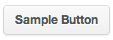
Change the Size
There are 3 different button sizes supported: small, medium and large. You can create different size buttons as follows:
Small<a href="#" class="mm-button small">Sample Button</a> | 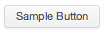 |
Medium<a href="#" class="mm-button">Sample Button</a> | |
Large<a href="#" class="mm-button large">Sample Button</a> | 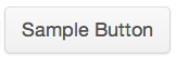 |
Rounded Corners
There are two different options for rounding the corners, standard rounding and pill-button rounding. You can control the rounding of the corners as follows:
Standard<a href="#" class="mm-button">Sample Button</a> | |
Pill Button<a href="#" class="mm-button rounded">Sample Button</a> | 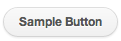 |
Change the Color
There are 11 different button colors supported: white, grey, black, light blue, blue, green, red, orange, yellow, pink and purple. You can create different color buttons as follows:
White<a href="#" class="mm-button">Sample Button</a> | |
Grey<a href="#" class="mm-button grey">Sample Button</a> | 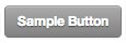 |
Black<a href="#" class="mm-button black">Sample Button</a> | 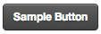 |
Light Blue<a href="#" class="mm-button light_blue">Sample Button</a> | 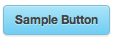 |
Blue<a href="#" class="mm-button blue">Sample Button</a> | 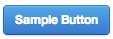 |
Green<a href="#" class="mm-button green">Sample Button</a> | 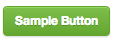 |
Red<a href="#" class="mm-button red">Sample Button</a> | 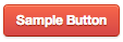 |
Orange<a href="#" class="mm-button orange">Sample Button</a> | 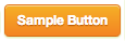 |
Yellow<a href="#" class="mm-button yellow">Sample Button</a> | 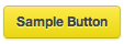 |
Pink<a href="#" class="mm-button pink">Sample Button</a> | 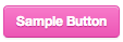 |
Purple<a href="#" class="mm-button purple">Sample Button</a> | 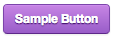 |
Create Variations by Combining Attributes
By using the size, rounding and color attributes together you can create over 60 variations. The following are sample variations for a green button:
Small Green Button<a href="#" class="mm-button green small">Sample Button</a> | 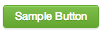 |
Medium Green Button<a href="#" class="mm-button green">Sample Button</a> | |
Large Green Button<a href="#" class="mm-button green large">Sample Button</a> | 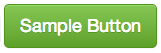 |
Small Green Pill Button<a href="#" class="mm-button green small rounded">Sample Button</a> | 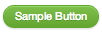 |
Medium Green Pill Button<a href="#" class="mm-button green rounded">Sample Button</a> | 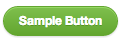 |
Large Green Pill Button<a href="#" class="mm-button green large rounded">Sample Button</a> | 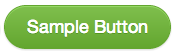 |